
Monday
The basic construction methodology is as follows, flat roof frame construction with primary custom steel UB’s and secondary UB/UC construction, also supporting the pre fabricated steel mullion framework for windows. Hollow core pre-cast concrete slab is used within the 1st and 2nd levels that span between the UC’s . The roof rakes at a 2degree pitch over the course of the warehouse toward the eastern side of the site. Similarly to the showroom, the parapet on the eastern side conceals the gutters and down pipes and maintains the roof profile from street level. The ground floor is a 250mm thick concrete slab poured with 2 layers of Rio mesh. 1000 X 1000 Pad footing are located below the slab where the UB’s pass through then welded to the base plate.
 complete model front view
 secondary structure UB/ UC support framework for expressed window mullion
 complete model front view
 secondary structure UB/ UC support framework for expressed window mullion
After re evaluating the site and understanding the importance of integrating the showroom with the warehouse, the faceted language provided structural lines which project from the warehouse becoming the folding planes within the façade of the showroom. This allowed a great abundance of natural light as the surrounding envelope of the showroom now faced up, further emphasizing the product on display. After deciding to reduce the second floor area in the showroom and create a split level, 2 floors were added to the warehouse on levels 1 and 2 above ground above the entry.


Architecture lives in the details…for my construction and structures 2 major project I decided to take a close look at the design aesthetic and detailing used by Rem Koolhaas from OMA architects. I decided in particular to study the Seattle Public Library and understand his design rationale and detail construction methodology as I undertook design on my warehouse and showroom complex. Thus the opportunity to design a building that amalgamated both functions seamlessly using hard lines and a faceted façade brought to fruition my concept design for No 3 Grunge Street. The poetry in the architecture lay within the simplicity of understanding and controlling the geometric façade three dimensionally as the surfaces responded to one another turning the corners of the building retaining a strong gesture.


Architecture lives in the details…for my construction and structures 2 major project I decided to take a close look at the design aesthetic and detailing used by Rem Koolhaas from OMA architects. I decided in particular to study the Seattle Public Library and understand his design rationale and detail construction methodology as I undertook design on my warehouse and showroom complex. Thus the opportunity to design a building that amalgamated both functions seamlessly using hard lines and a faceted façade brought to fruition my concept design for No 3 Grunge Street. The poetry in the architecture lay within the simplicity of understanding and controlling the geometric façade three dimensionally as the surfaces responded to one another turning the corners of the building retaining a strong gesture.
Week 11 & 12 further developing the final model
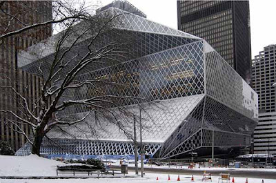
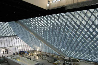
Funding for the new Seattle Central Library building, as well as other construction projects throughout the library system, was provided by a $196.4 million bond measure, called "Libraries for All," approved by Seattle voters on November 3, 1998. The project also received a $20 million donation from Bill Gates, of Microsoft.
Rem Koolhaas and Joshua Prince-Ramus of the Dutch firm Office for Metropolitan Architecture (OMA), working in conjunction with the Seattle firm LMN Architects, served as the building's principal architects. Ramus served as the partner in charge. Ironically, OMA was not one of the firms invited to compete for the project. Ramus, formerly a Seattle resident, found out from his mother one day in advance that the library board was inviting interested firms to attend a mandatory public meeting. He attended, flying in from, and OMA ended up winning the project.
Deborah Jacobs, Chief Librarian in the Seattle Public Library system, spearheaded the project from the library's perspective and served as the primary client voice, while Betty Jane Narver served as president of the Library Board.
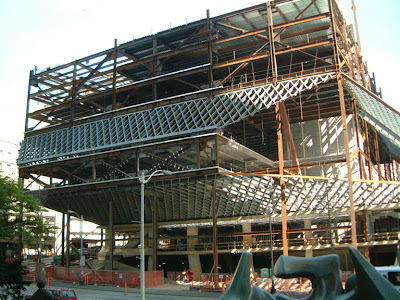
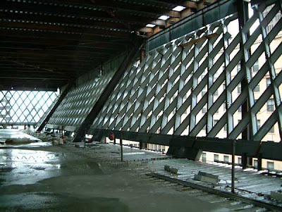
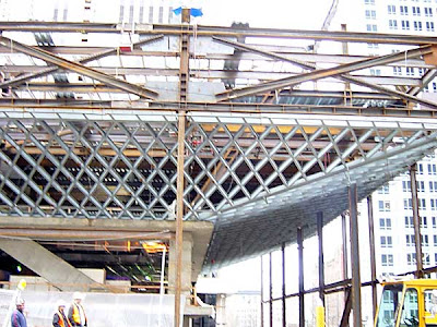


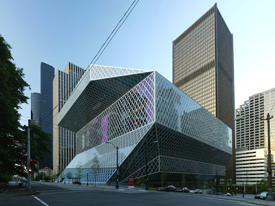
The Seattle Central Library is the flagship library of the Seattle Public Library system. The 11-story (185 feet or 56 meters high) glass and steel building in downtown Seattle, Washington was opened to the public on Sunday, May 23, 2004. Rem Koolhaas was the principal architect. The 362,987 square foot (34,000 m²) public library can hold about 1.45 million books and other materials, features underground public parking for 143 vehicles, and includes over 400 computers open to the public. Over 2 million individuals visited the new library in its first year. It is the third Seattle Central Library building to be located on the same site at 1000 Fourth Avenue, the block bounded by Fourth and Fifth Avenues and Madison and Spring Streets. The library has a unique, striking appearance, consisting of several discrete "floating platforms" seemingly wrapped in a large steel net around glass skin. Architectural tours of the building began on June 5, 2006.

Week 7 & 8
Remment Koolhaas (born November 17, 1944 in Rotterdam) is a Dutch architect, architectural theorist, urbanist and "Professor in Practice of Architecture and Urban Design" at the Graduate School of Design at Harvard University, USA. Koolhaas first studied scriptwriting at the Dutch Film Academy, and was then a journalist for the Haagse Post before starting studies, in 1968, in architecture at the Architectural Association School of Architecture in London, followed, in 1972, by further studies at Cornell University in New York. Koolhaas is the principal of the Office for Metropolitan Architecture, or OMA, and of its research-oriented counterpart AMO, nowadays based in Rotterdam, The Netherlands. In 2005 he co-founded Volume Magazine together with Mark Wigley and Ole Bouman.
Koolhaas first came to public and critical attention with OMA (The Office for Metropolitan Architecture), the office he founded in 1980 together with architects Elia Zenghelis, Zoe Zenghelis and (Koolhaas's wife) Madelon Vriesendorp in London. They were later joined by one of Koolhaas's students, Zaha Hadid - who would soon go on to achieve success in her own right. An early work which would mark their difference from the then dominant postmodern classicism of the late 1970s, was their contribution to the Venice Biennale of 1980, curated by Italian architect Paolo Portoghesi, titled "Presence of the Past". Each architect had to design a stage-like "frontage" to a Potemkin-type internal street; and the OMA scheme was the only modernist scheme among them.
Other early critically-received (yet unbuilt) projects included the Parc de la Villette, Paris (1982) and the residence for the President of Ireland (1981). The first large project by OMA to be built was the Kunsthal in Rotterdam (1992). These schemes would attempt to put into practice many of the findings Koolhaas made in his book Delirious New York (1978),[1] which was written while he was a visiting scholar at the Institute for Architecture and Urban Studies in New York, directed by Peter Eisenman.
Other early critically-received (yet unbuilt) projects included the Parc de la Villette, Paris (1982) and the residence for the President of Ireland (1981). The first large project by OMA to be built was the Kunsthal in Rotterdam (1992). These schemes would attempt to put into practice many of the findings Koolhaas made in his book Delirious New York (1978),[1] which was written while he was a visiting scholar at the Institute for Architecture and Urban Studies in New York, directed by Peter Eisenman.


status - Under construction
QSTP's vision is to be an internationally recognised hub for research and commercialisation.We accomplish this by providing
world-class infrastructure and services to tenant organisations that are involved in the development and application of technology.
support programs that foster the creation and growth of young technology companies.
Why are we pursuing this vision? Ultimately to benefit Qatar's society and economy by:
raising Qatar's capacity to undertake applied research and obtain commercial value from its results.
increasing the productivity and competitiveness of Qatar industry through the development and application of cutting-edge technologies.
creating wealth and diversifying Qatar's economy through the launch of start-up technology businesses.
generating high value, knowledge-based jobs, in particular for graduates of Qatar's universities..
 as you can see the structural grid to the building is a vortex like structure that accomodates all the building vertical transport services through the 4 floors
 planning for the "sendai mediatheque" began in 1994. at the beginning, plans called for a multifunctional facility comprised of a library, gallery, visual media center that also contained services to aid the sight-and hearing-impaired.subsequently, plans changed so that instead of simply being a "mixed-use" facility, it was intended to encompass a larger sphere of functions that would allow the facility to operate as a unified "mediatheque" with common goals to respond to a continuously changing information environment and users' diverse needs.the "sendai mediatheque will gather, preserve, exhibit, and present various forms of media without being bound to form or type. this public facility for the 21st century will, through its various functions and services, be able to support the cultural and educational activities of its users.
 http://www.smt.city.sendai.jp/en/


From Wikipedia, the free encyclopedia
Jump to: navigation, search
Sendai Mediatheque, a building in Sendai designed by Toyo Ito
Toyo Ito (伊東豊雄, Itō Toyo'o; 1941-) is considered "one of the world's most innovative and influential architects" (Designboom).
Ito is known for creating extreme conceptual architecture, in which he seeks to melt the physical and virtual worlds. He is a leading exponent of architecture that addresses issues of the contemporary notion of a 'simulated' city.
Born in Japan, Ito graduated from Tokyo University's, Department of Architecture in 1965. After working for Kiyonori Kikutake Architect and Associate from 1965 to 1969, he started his own studio, 'Urban Robot' (urbot) in 1971, in Tokyo. In 1979, the studio changed its name to Toyo Ito & Associates, Architects. Throughout his early career Toyo Ito constructed numbers of private housing projects that revealed the hiden layer of urban life in Japan. His most remarkable early conceptual contributions were made through the projects of this scale. See White U in 1976 and Silver Hut in 1984.
With the 'Pao for the Tokyo Nomad Girl' Project's in 1985 Toyo Ito developed a vision of a life of an Urban Nomad, illustorious to the human life involved in the bubble economy of Japan.
Tower of winds in Yokohama in 1986 and Egg of winds in 1991 are interactive landmarks in the public space as the result of creative confrontation with the technical possibilities which the future will bring.
Toyo Ito is known in Japan to raise talentful younger generation of architects. Architects who worked for his office includes, Kazuyo Sejima (SANAA), Klein Dytham Architecture
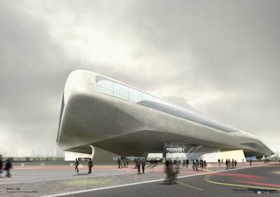 - I-MAD ARCHITECTS China
Very slick!
whilst working at Lab architecture studio for 9 months we competed against Mads winning competition bid for the guangzhou sun plaza.
The Guangzhou international biology island is a new science and technology development zone led by biological industry. Sun Plaza is an integral part of the technology and service system on the island, which greatly promotes the general environment image of the biology island. Situated at the island center near Guanshan watercourse, Sun Plaza is on the same axis with the campus city across the river. The site area is 107,076 sqm in all, and the building area is 73,000 sqm. Sun Plaza is the center of the sceneries, meetings, exhibitions, technologies, and services on the international biology island, and it will make another landmark for Guangzhou city by the time of completion. Considering the existing situation of Sun Plaza, we seek to enhance the function of architecture with innovative design which allows the nature and human activities to connect to and interact with each other. Sun Plaza is designed to resemble an undulating surface, where meetings, exhibitions, technologies, and services center are linked up and formed an integral construction. The architecture floats on the island, making full use of the open space while protecting three ancient ancestral temples in this area: Chengong temple, Huadi temple and Chenshi Dazong temple. The architecture is no longer deemed as an obstruction to the space, in fact, it has developed an open space where the new architecture and cultural relics co-exist in perfect harmony. Sun Plaza consists of nine core tubes, offices, business, meeting, exhibition, scientific research function area, where the concept for independent building is overlooked. The 3-dimensional organization makes it possible for the outdoor open space to be shared while retaining the independence of each single unit. Moreover, the building creates two layers vertically: the ground-level natural landscape system and the upper structure of urban scenery platform. The sceneries and various facilities create a huge garden-like architectural space. People could enter Sun Plaza from all around to experience and enjoy the sharp contrast posed by the old architecture and the new ones, the natural and the artificial sceneries.


Week 6 case study
This is an IT professional's weekend house near the Great Wall of Beijing. The driving concept of this scheme is Folding Landscape. The down-slope site facing the hills and river makes it possible to exploit the contours. A continuous volume is being pulled up from the ground level and faces the natural landscape. A glass-enclosed living space is inserted in-between the volume and ground. The rising volume and the levels inside resemble a continuous and undulating landscape, and a courtyard inserted at strategic position connects with the outside on the ground floor. The ground floor plan follows the example of Mies Van Der Rohe's Farnsworth House, and on the upper level the plan becomes reverse -- a pool enveloped by glass roof and floor, so the sunlight could shine through the water and the glass floor of the pool and cast upon the ground floor.
http://www.i-mad.com/index2.htm
http://www.i-mad.com/index2.htm
Subscribe to:
Posts (Atom)


